Menu Design That Sells: Layout, Placement and Pricing Psychology
Two cafés can sell the exact same dishes at the exact same prices and post completely different margins. Same croissants, same flat whites, same suppliers. The only difference is how the menu is laid out.
That's not a trick. It's just that a menu isn't a price list - it's the most-read piece of sales material in your café. Every customer looks at it. Most of them decide what to spend in under two minutes of reading it.
This post is about the physical side of that. Not what's on your menu - that's menu engineering, and a different job. This is about how the menu looks and reads, and how that quietly steers people toward the items you actually want to sell.
How People Actually Read a Menu
You've probably heard about the "golden triangle" - the idea that eyes land in the middle of a menu, drift to the top right, then the top left, and you should put your money-makers there.
Be honest with yourself about this one. That folklore comes from large, multi-panel restaurant menus. If you're running a café with a single A4 card, a wall-mounted board, or a small counter card, those rules barely apply.
What does hold up across formats is simpler:
- People scan, they don't read. They skim for something that catches them, then stop.
- The first and last items in any list get read most. This is primacy and recency - the middle of a long list disappears.
- Where the eye naturally lands gets your attention budget. On a board that's roughly the top; on a card it's the top of each section.
So the practical move isn't to obsess over an imaginary triangle. It's to put your high-gross-profit and signature items where the eye stops - at the top and bottom of each list, and near any visual feature like a box, a line, or a photo.
Pricing Psychology, Applied Honestly
There's a lot of nonsense written about menu pricing psychology. Some of it works. Some of it is the sort of thing that suits a chain restaurant and looks faintly ridiculous in a proper independent café. Here's what's worth doing.
Drop the £ sign and the trailing zeros
Research is fairly consistent that customers spend a little more when the currency symbol is gone. The symbol is a small reminder that they're parting with money. So "Flat white 3.4" reads softer than "£3.40".
You don't need the trailing zero either. "3.4" is cleaner than "3.40". It looks less like an accounting document and more like part of the menu.
Stop the price-scanning column
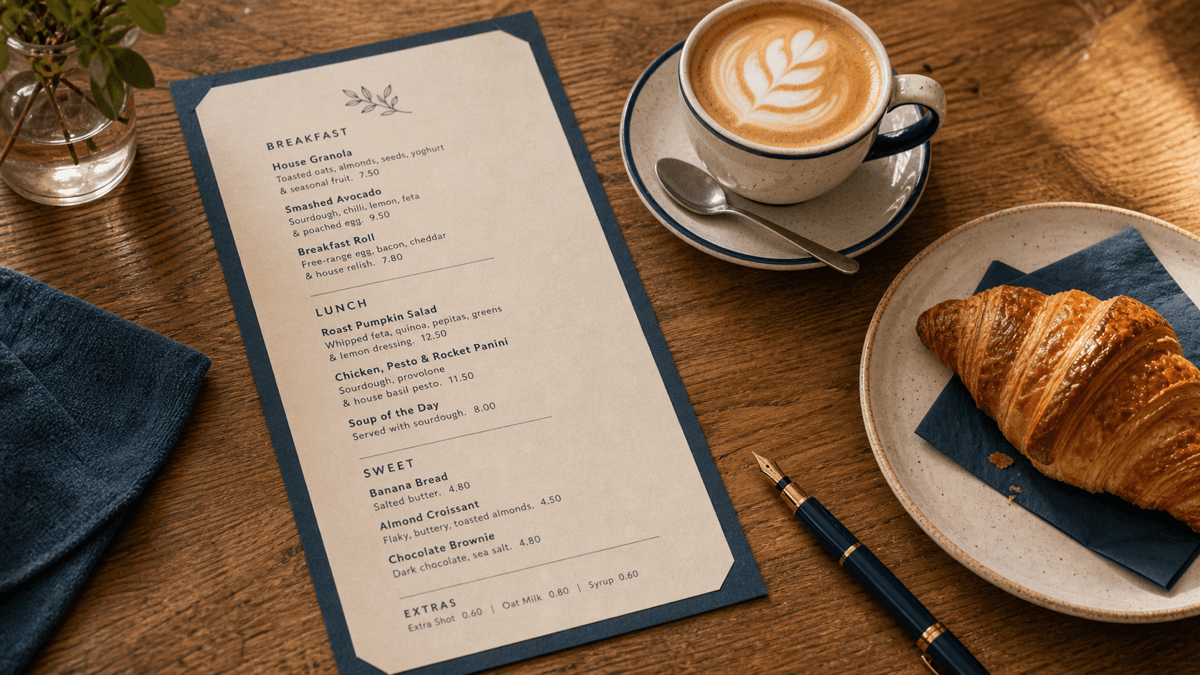
This is the big one, and most café menus get it wrong. If you list every dish on the left and right-align all the prices in a neat column down the right edge - especially with leading dots - you've built a price-comparison tool.
The customer's eye runs straight down that column. They find the cheapest thing and order it. You've just trained them to shop on price.
Instead, tuck the price in at the end of the dish description, in the same size font, no dots leading to it. The customer has to read the description to find the price. Now they're buying the dish, not comparing the column.
Round prices vs .95 and .99
The "always end in 9" advice comes from supermarkets and value brands. A £6.99 brunch plate signals cheap and cheerful. If that's your positioning, fine.
But a quality café usually does better with round or near-round numbers - £7, £4.50, £12. They read as confident and considered. The .99 trick says "we're competing on price". Round numbers say "this is worth it". Match the convention to the café you're actually running.
Anchors and decoys
Put one genuinely premium item near the top of a section and it does quiet work for everything below it. If your top brunch plate is £14, the £9.50 one beside it suddenly looks very reasonable. The £14 plate doesn't have to sell in volume - it just has to make the £9.50 plate feel like good value.
This is anchoring, and it's one of the few pricing tricks that genuinely lifts the average spend without anyone feeling manipulated.
Bundles and set offers
A "flat white and a croissant for 5.5" does two things. It nudges people who'd have bought just the coffee into a second item, and it stops them mentally totting up two separate prices. Bundle your high-margin pairings and you raise average spend without discounting anything that matters.
Describe the Dish, Justify the Price
A name on its own sells nothing. "Cheese toastie - 6" is a fact. "Aged Cheddar and caramelised onion on our own sourdough, grilled until golden - 6" is a sale.
Short, sensory descriptions lift sales and, just as importantly, justify the price. A few well-chosen words about texture, method or origin do more than any discount.
- Be sensory, not flowery. "Crisp", "slow-roasted", "house-made", "still warm". One or two words, not a paragraph.
- Use provenance where it's real. "Oxfordshire free-range eggs", "beans roasted ten miles away". Don't invent it - customers can tell, and one fib undermines the lot.
- Name things with a bit of character. "The Burford Brunch" travels further than "Large Breakfast". A name people can repeat is a name they recommend.
Keep it honest and keep it tight. The goal is to help someone picture the dish and feel the price is fair - not to write poetry.
Less Is More
The single biggest favour you can do your menu's design is to put fewer things on it.
A long menu can't be laid out well. There's no room to give your best items the space they deserve, descriptions get cut to fit, and the customer drowns in choice. A tight menu has room to breathe, room to describe, and room to steer.
Fewer items also concentrate your sales onto your strongest performers, which is exactly where you want them. I've made the full operational and financial case for why smaller menus make more money elsewhere, but for design purposes the point is simple: you can't lay out forty items beautifully, and you can't steer a customer who's already overwhelmed.
If a section has more than six or seven items, that's usually the first thing to fix before you touch anything else.
Boards, Printed Cards or Digital
The format you choose changes what's possible, so pick deliberately.
- Wall boards read as established and confident, and they're cheap to run. But they're a pain to keep current - rubbing out a price every time a supplier moves means most boards go stale, and a stale board quietly costs you margin.
- Printed cards give you the most control over layout, descriptions and placement. The catch is reprinting. If your costs are moving, a card you printed in spring can be underpricing dishes by summer.
- Digital screens or QR menus update instantly, which is their whole point - change a price once and it's live everywhere. They can feel less warm, though, and a QR-only menu still annoys a chunk of café customers.
There's no single right answer. Most independents end up with a printed core menu plus a board for specials, which gives you control where it matters and flexibility where it doesn't. Whatever you choose, the rule is the same: an out-of-date menu is a menu working against you. Keeping prices current is the whole reason getting your prices right in the first place matters so much - good design steering people toward a dish you're underpricing just loses you money faster.
Design Steers - Data Decides
Here's the part that ties it all together. None of this layout work is worth much until you know which items you actually want to push.
Beautiful placement on a low-margin dish just sells more of your worst item. You need to point all this design effort at the right targets - your genuine stars. And you can only know those from two things: your real margins and your real sales mix.
Margins come first. If you haven't costed your dishes properly, you might be lavishing your best menu spot on something you're quietly losing money on. It's worth being clear-eyed about the maths here, because confusing markup and margin is the classic way operators think a dish is profitable when it isn't.
That sales-mix view is the other half. Roughly 20% of your menu drives 80% of your turnover, and those are the items your layout should be quietly funnelling people toward. If you've not looked at yours, the 80/20 of your menu walks through how to pull it apart. Design without that data is just decoration.
Re-Lay Your Menu This Week
You don't need a designer or a budget for any of this. Print your current menu, sit down with a coffee, and work through this checklist:
- Kill the price column. Tuck every price into the end of its description, same font, no dotted leaders.
- Drop the £ signs and trailing zeros. "4.5" not "£4.50".
- Move your stars. Put your highest-margin and signature items at the top and bottom of each section.
- Add an anchor. One premium item near the top of a section to make the rest look reasonable.
- Write three descriptions. Take your three best margin items and give each a short, sensory line.
- Cut the deadwood. If a section has more than six or seven items, remove the weakest ones.
- Check it's current. Make sure every price reflects what the dish actually costs you today.
That's an hour's work for, quite often, a measurable lift in average spend across every cover that walks in afterwards. Same dishes, same prices, more profit - all from how the menu reads.
Ed O'Brien has run Hunters Cake Company for 17 years across cafés in Witney, Burford, and a bakery in Carterton, Oxfordshire. He's building Brikly - modular tools that give independent café owners the same data the big chains have, without the big chain price tag.